velofix
velofix provides a convenient Mobile Bike Shop experience at your home, office or event. With Franchises across Canada and the US, every velofix Mobile Bike Shop is locally owned and operated by residents within those communities. Professionally trained and certified mechanics provide onsite bike maintenance and building services for every type of bike.
Andrea Moretti from hi-end.ca contacted me to assist him with the redesign of the velofix website. My role was to provide support to Andrea in the areas of Discovery, Planning, Wireframes, Prototyping, and Design.
Discovery & Planning
The founders’ and executive team from velofix sat down with Andrea and I to provide an overview of the pain points they were having with their existing website and to learn what they would like to see in the next version of the website to help them grow as a company. My experience working with 1-800-GOT-JUNK? (a franchise based company in North America) allowed me to understand the ideas and strategy that the velofix executive team had, but most importantly, ask the right questions.
A responsive, modern, easy to use, on brand WordPress website was required but the website also needed to serve new customers (educate what velofix does), serve current customers (repeat booking services), sell more franchises (educate and enter new markets), and support current franchises (booking system and marketing tools).

Wireframes & Prototyping
Understanding velofix as a company and its customers helped us formulate user personas that answered the question, “Who are we designing for?” and how to align strategy and goals to specific user groups.
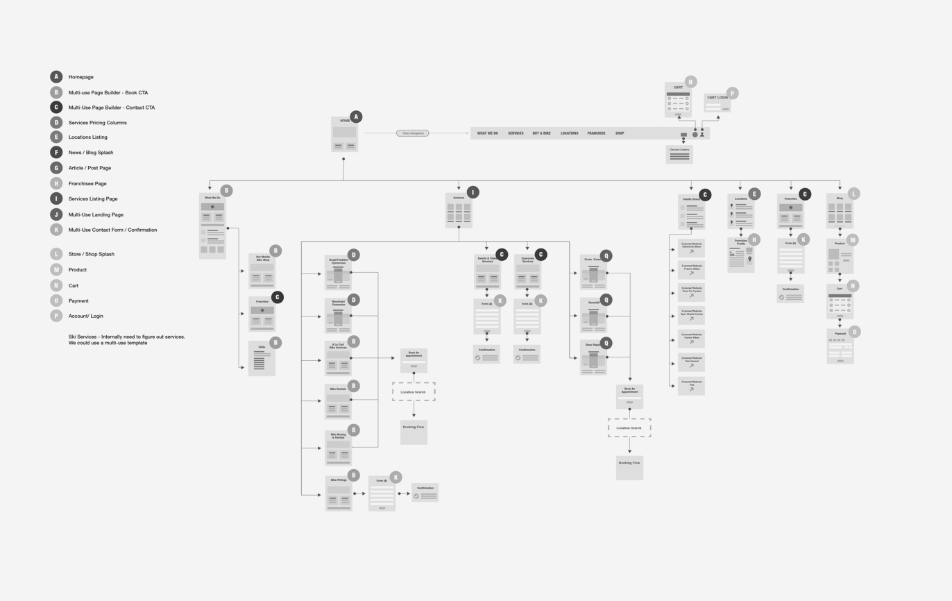
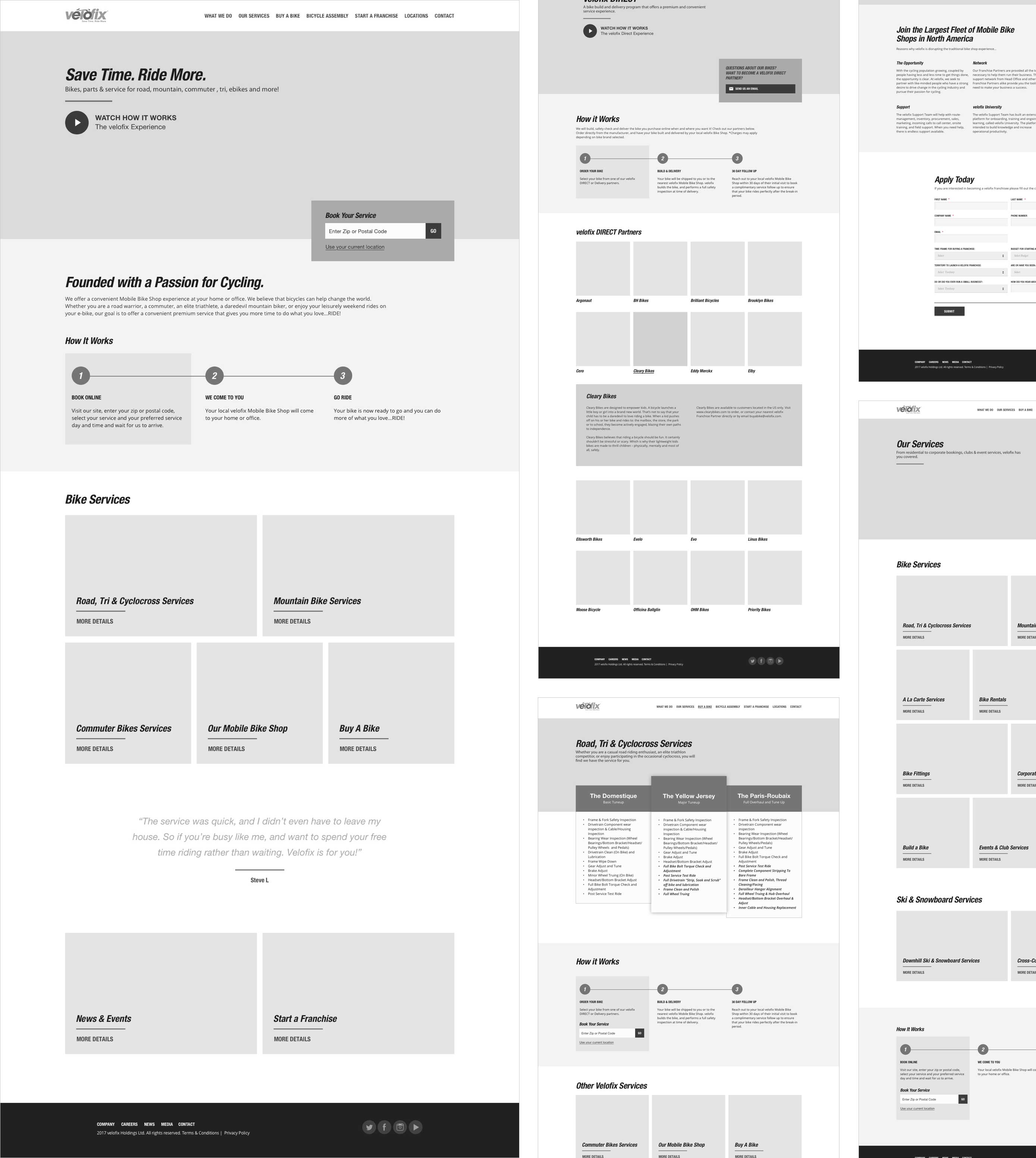
In this stage, we presented a sitemap and high fidelity interactive wireframes to the velofix team. The sitemap provided a hierarchical view of pages and user journeys. High fidelity interactive wireframes helped demonstrate how the website would work at a structural level (sitemap) and how the content and functionality of pages takes into account user needs and user journeys (personas).
Brand Application & Style Development
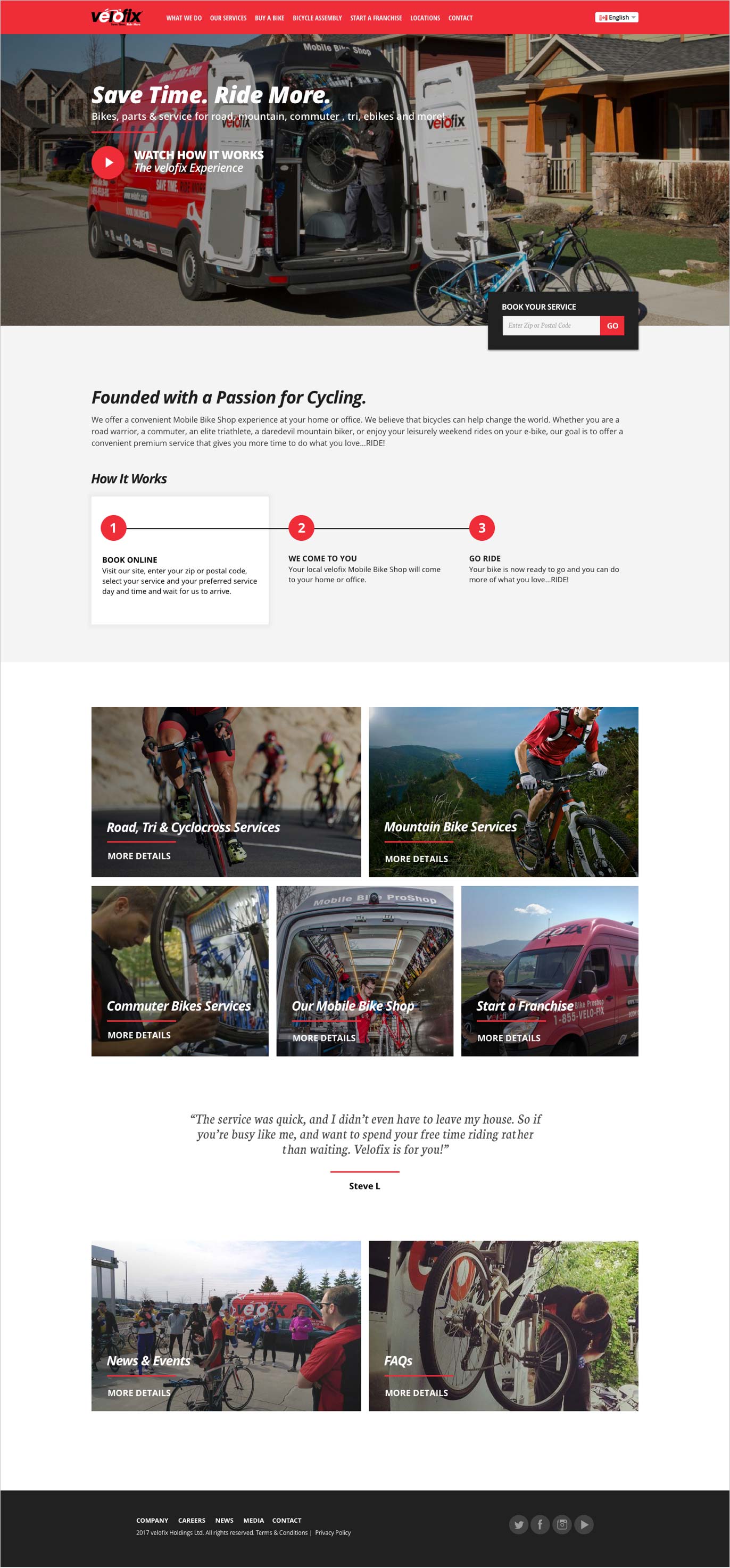
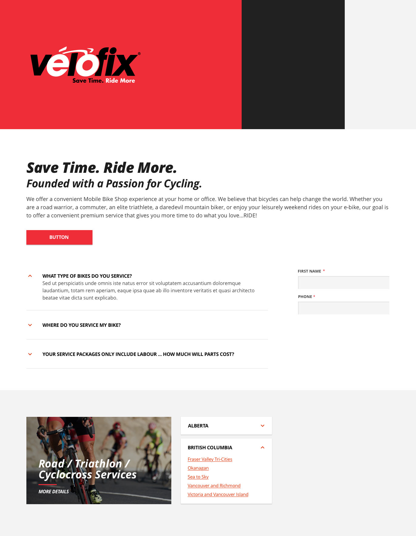
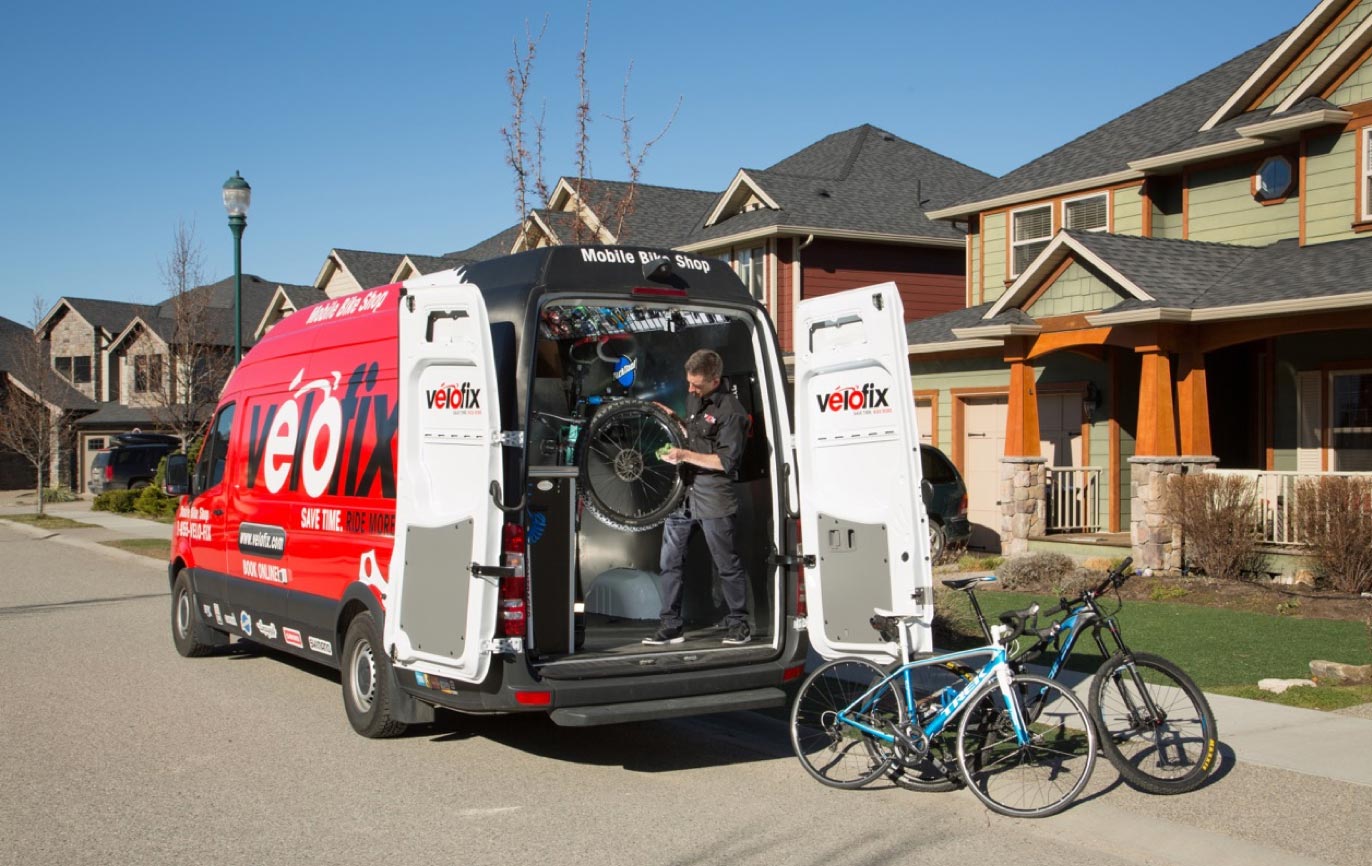
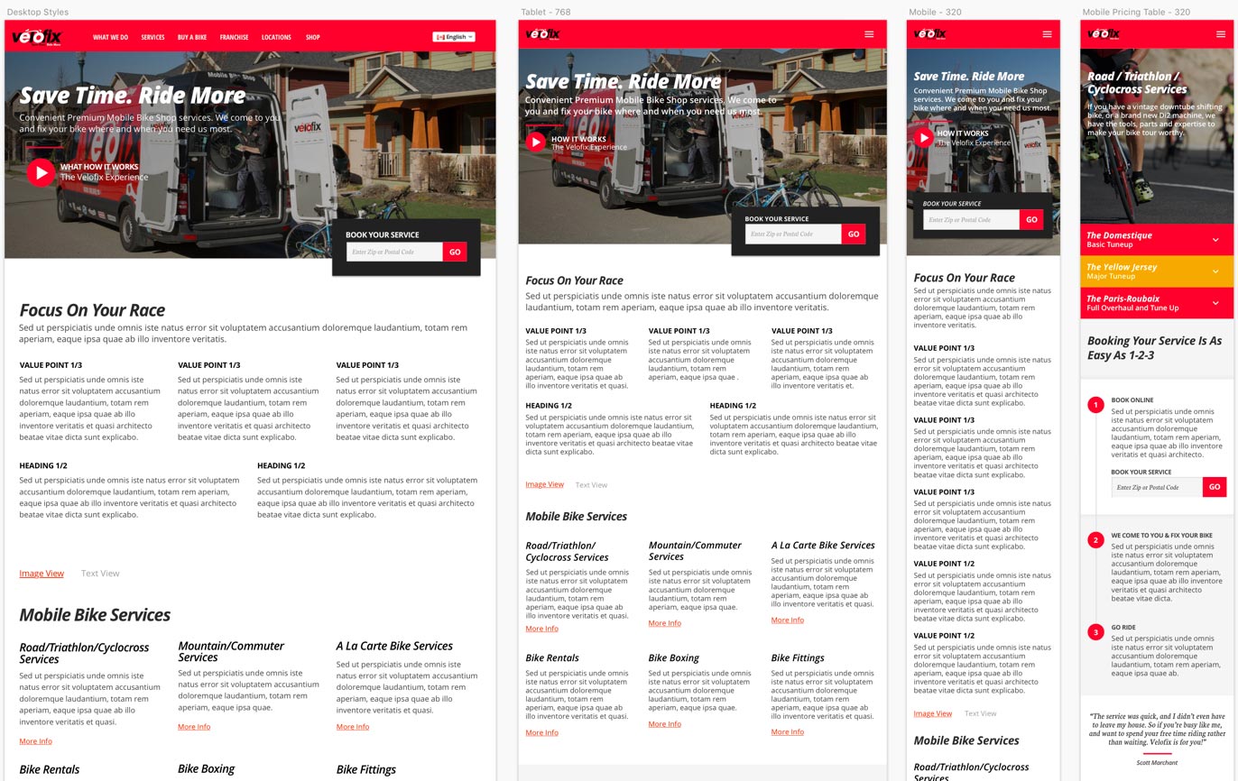
The existing velofix brand is very bold, recognizable, and covers their Mercedes Sprinter vans from bumper to bumper. With this in mind, I worked out how the velofix brand would be applied visually to the look and feel of the interactive elements and responsive breakpoints.
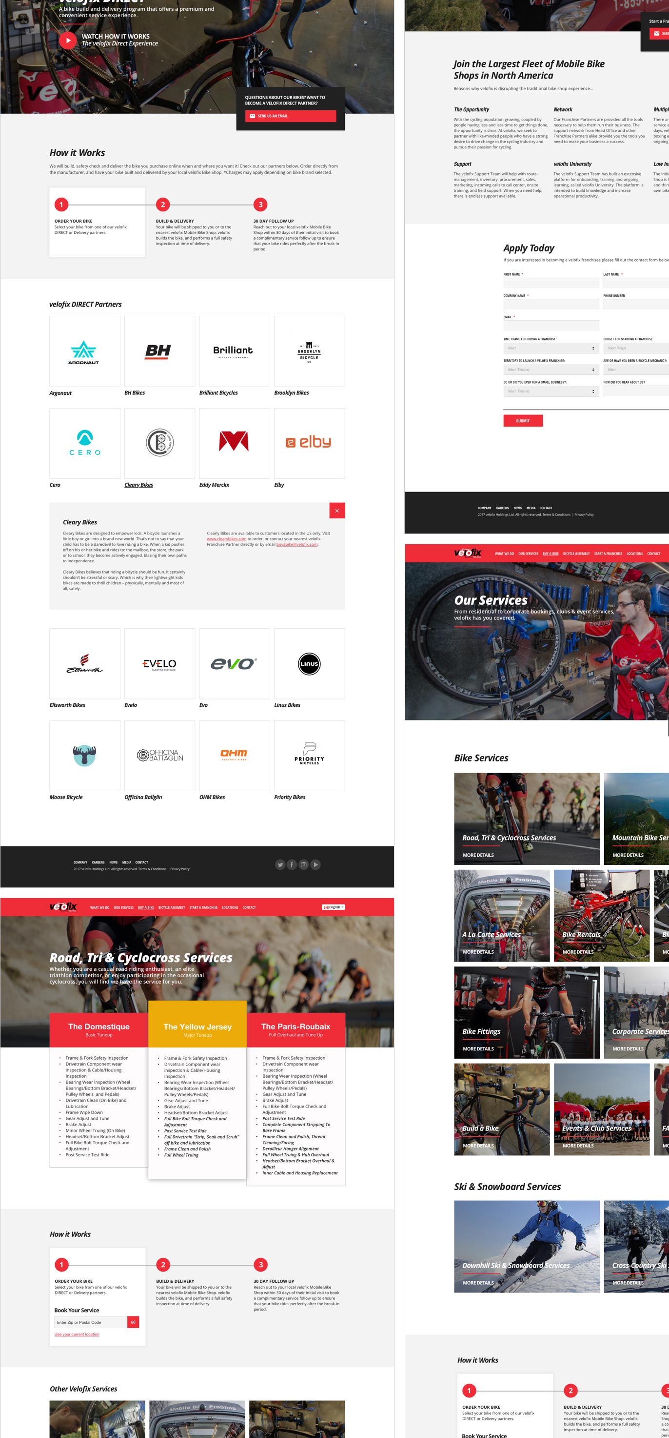
In our last meeting, Andrea and I presented high fidelity interactive wireframes with no colour or images to focus on the information hierarchy and how the content and functionality of pages takes into account user needs and user journeys. In this stage, I created high fidelity interactive mockups that bring together form, function, and the visual language.
I found this process helped the stakeholders to experience how the website looked and functioned (without any coding), removing assumptions and allowing for better feedback.
Bringing It All Together
All the work done in the previous stages now comes to fruition. Andrea has taken my design layouts and turned them into working responsive HTML, CSS, JavaScript, and managed with the Content Management System WordPress. A development site had been created to allow the velofix team to add content and allow for all teams to refine website functionality and testing.
In addition, Andrea contributed a large amount of time and effort behind the scenes streamlining and integrating the velofix booking system and franchisee access to the website for their franchise updates. The redesign was launched in 2016.
